Portals of Prayer App

In Brief

After user data indicated it was difficult to access certain content, as well as further insights to guide much needed updates, I redesigned the UX/UI of the Portals of Prayer app to improve content discoverability, accessibility, and reduce complexity.

I collaborated with stakeholders to achieve their business goals and with developers to ensure consistency and realize our vision. 

Duration

Fall 2019 - April 2020

Scope

Lutheran devotional mobile and web app

Tools

Adobe XD, HTML/CSS, Photoshop, Github

Team

Solo lead designer, working with 2-3 developers

Role

Research, prototyping, usability testing, design, CSS styling

The Problem

70% of Portals of Prayer app users use the app only to read devotions, but the app wasn't not been updated since its initial launch in 2016. Content available in the print version–including specific prayers and author biographies–is difficult for users to find. There’s also an opportunity to improve accessibility. In addition, negative reviews and lack of awareness are sending potential users to other devotion apps, and they are missing out on POP's quality, doctrinally reviewed content. 

Solution

Strategy

To identify any UX weaknesses, I started with a heuristic review of the app. I also evaluated the Voice of the Customer feedback, survey results, reviews, and support tickets. 

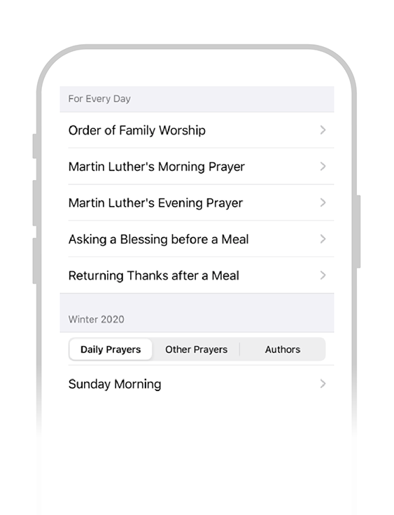
I learned that users would like to easily access author bios and prayers. Features such as dark mode were requested, and this prompted an internal assessment of the overall accessibility of the app.

Stakeholders, developers, and I reviewed the research to prioritize our updates.

Old version
The old Portals of Prayer app design
POP Wireframes
POP Archive wireframes
Wireframes for devotion view, browsing archives, and devotion archive

Design

Via the user survey, I learned that users would like to easily access author bios and prayers. I also wanted to make accessibility a priority by adding a text size adjustment setting and improving the color contrast. Simplifying the toolbar would reduce visual load, but also assist users who may not have as fine motor skills by giving them bigger touch targets for the most frequently used items.

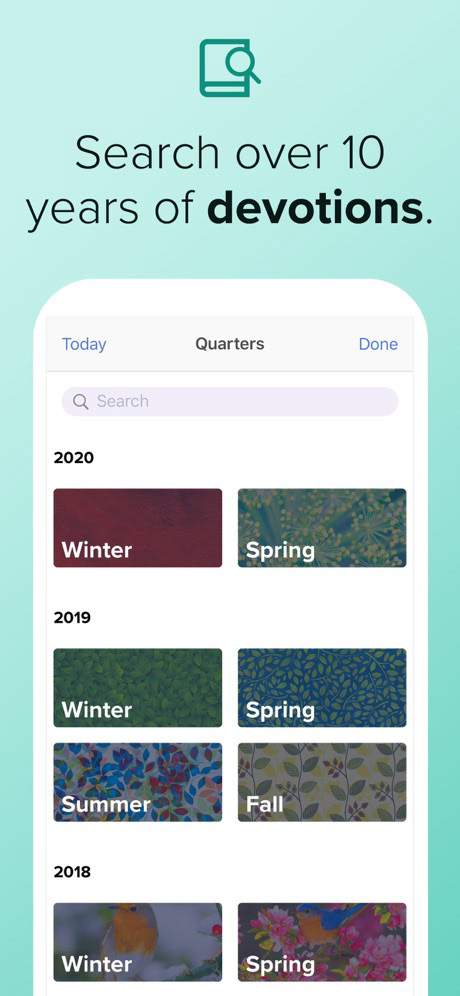
Refining the audio controls, adding dark mode, and a devotion archive spanning 10 years were also included in the update. ​​

Stakeholders also wanted to create a "trial" model version of POP with a paywall and a walkthrough explaining the new features.

Screenshot of devotion app
Screenshot of POP Archives
Screenshot of POP app prayers
Screenshot of POP app settings

Implementation

Due to budget constraints, we were only able to test the build with an in-house tester and made adjustments based on their findings. 

After wireframe approval, I created higher fidelity wireframes and provide to developers. I provided support as they coded the new design to maintain consistency and make other design decisions - including the port to Android. We utilized Github and Slack for version control and communication.

I also designed other marketing materials and app store graphics, highlighting the new features of the app.

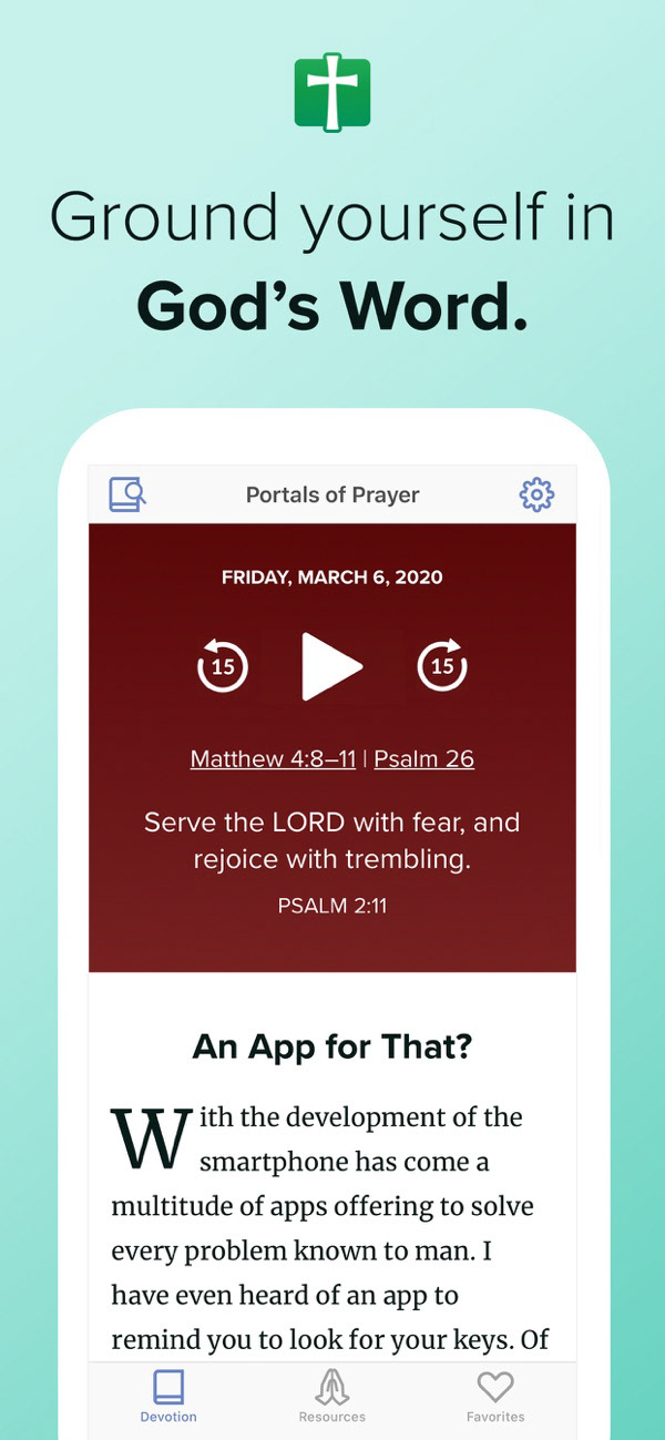
App store graphics - Ground yourself in God's Word
Search over 10 years of devotions.
Favorite the best devotions.
Adjust the app to your needs.

Outcome

The new design launched successfully in April 2020. Because of strong communication between the devs and myself, we met our release date even after shifting to 100% remote work due to the Covid-19 pandemic. Not only did we see an increase of positive feedback on the app store, but Portals of Prayer hit #26 on the "Top Free List" in the Magazines & Newspapers category in April 2020. 

We also launched a marketing campaign to advertise the new release to potential users.

This was a successful, data-driven design where we were able to make small changes that had big impact for our users. 

Takeaways

  • Communication is key with your development team, especially when going remote! This project led to improved process between us.
  • Occasionally utilizing native iOS patterns can increase familiarity and usability for the user, and lessen development time.